Medelita
Medelita.
DURATION
February 2020
MY ROLE
UX/UI Design
THIRD FIELD
Web Design
The Goal
Medelita sells high end scrubs and lab coats for modern medical professionals. They wanted to revamp their website to improve their online shopping experience and increase their conversion rate.
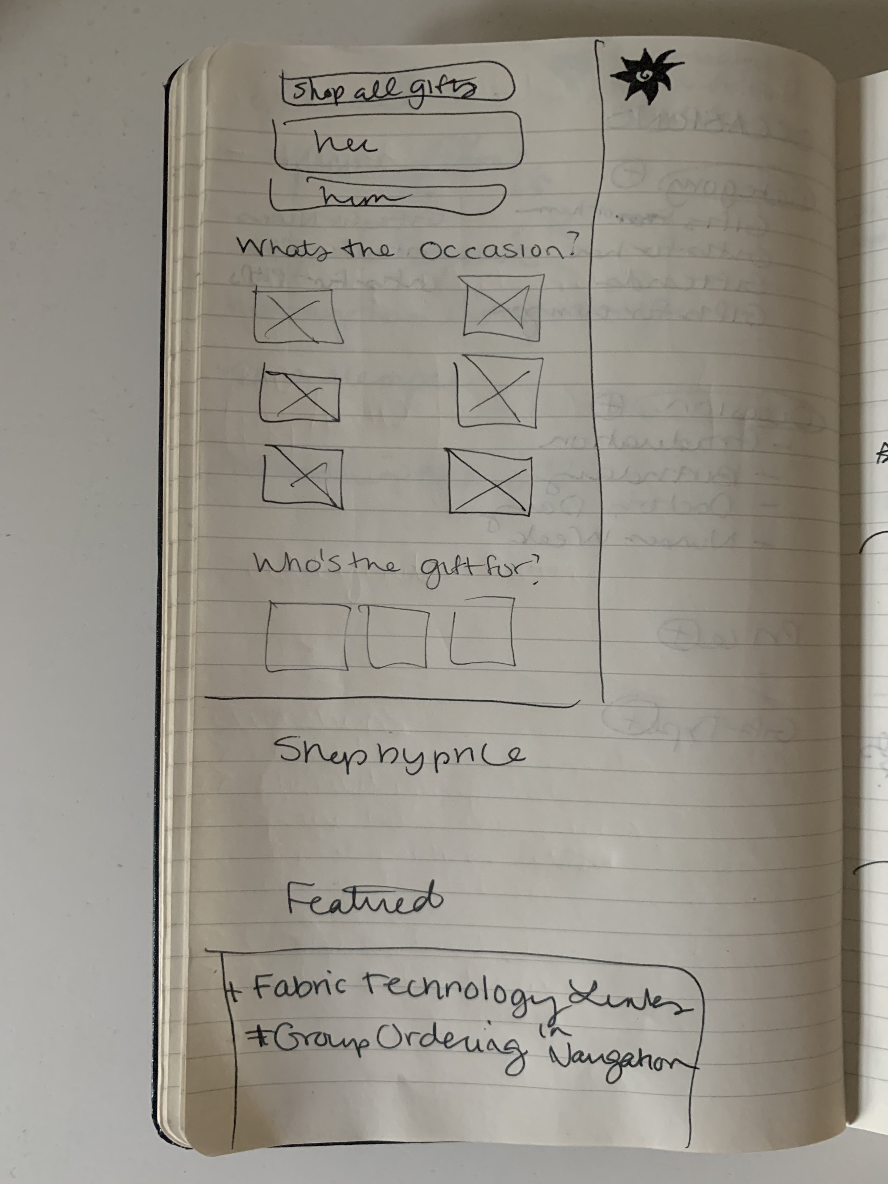
Medelita wanted my team to redesign their landing and group orders pages. They also wanted a design of a completely new occasions page, for friends and family to shop for medical professionals.
Competitive Analysis
I began my work with an overview of Medelita's client history and the site as a whole with my peer UX Strategist. I analyzed the landing pages and the group orders pages to see the material I was working with, and explored the site to see what existing content could be brought to light on these pages, such as past partnerships, innovative technology, or design philosophies.
I also conducted a competitive anaylsis on other premium scrubs brands, such as FIGs and Jaanuu, to see examples of how they tell their brand stories.
Initial Sketches
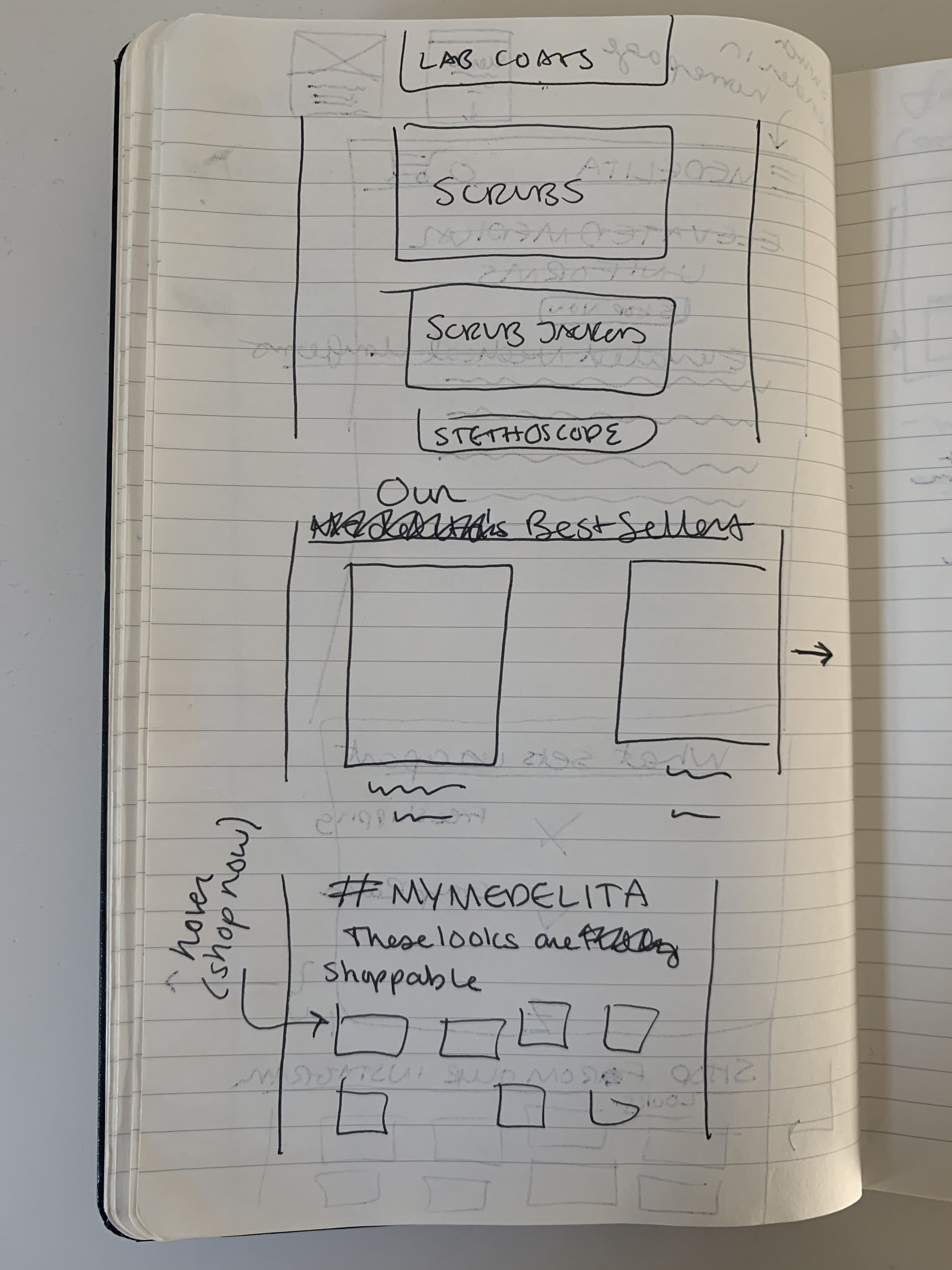
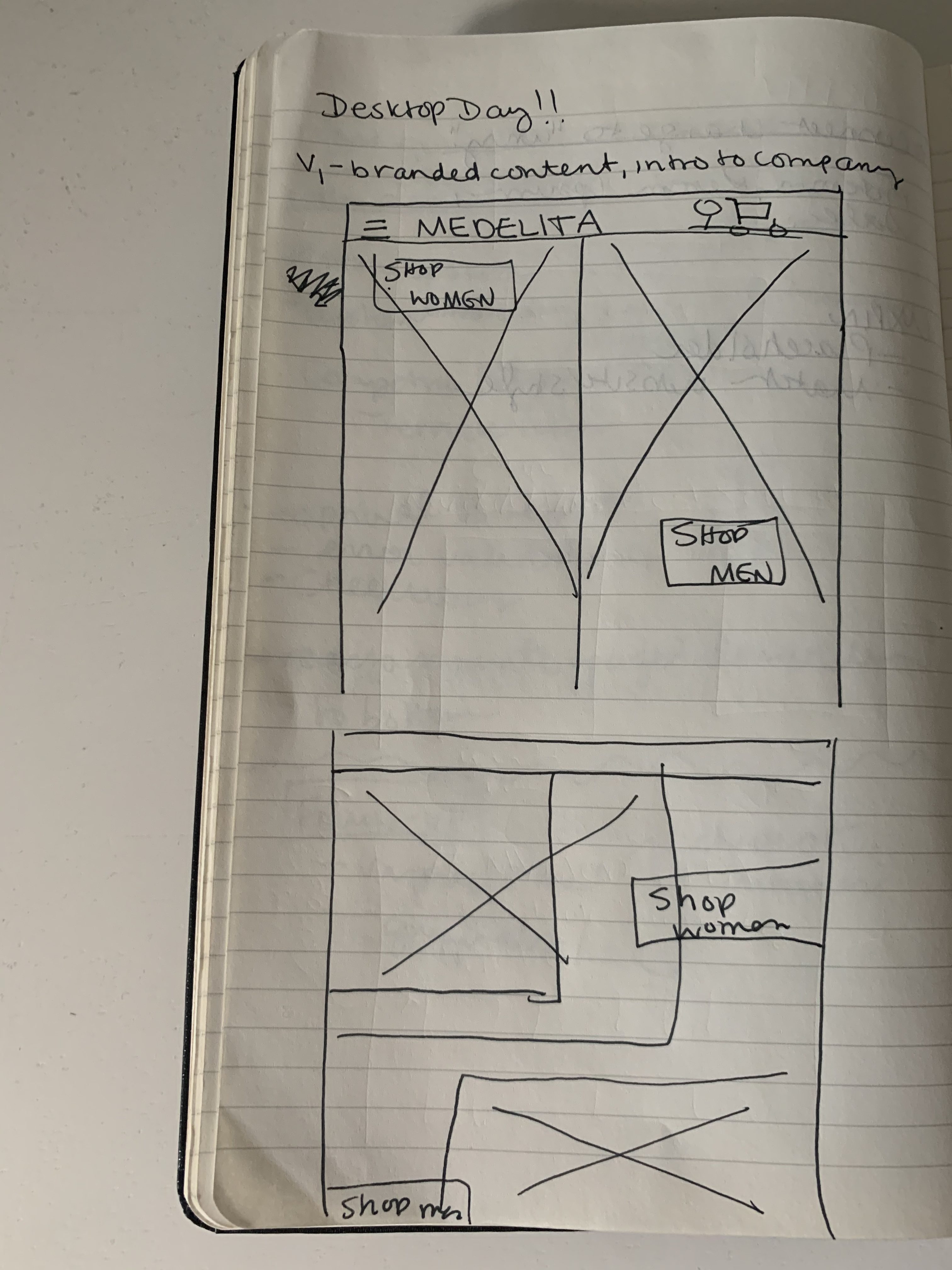
I started my ideation process by doing some rough sketches on paper of what the new pages could look like. In this phase of the process, I was focused on making decisions surrounding what content I wanted to keep, rework, and remove from the original pages.
I brainstormed the inclusion of branded content I found in other areas of the site that we could bring to the landing page for new users to introduce them to Medelita.
The Landing Page
The goal of the landing page redesign was to better tell Medelita's brand story. I wanted to assure first time visitors of the quality of products across the site and of Medelita's well established prescence in the industry.
Some of the opportunities I addressed in my redesign include that the original page was:
• Lacking overall mission and brand story
• Utilizing too much vertical height with categories on the page, didn't quickly convey product offerings
• Lacking social proof
• Lacking context and incentive for group rates
Medelita's original landing page.
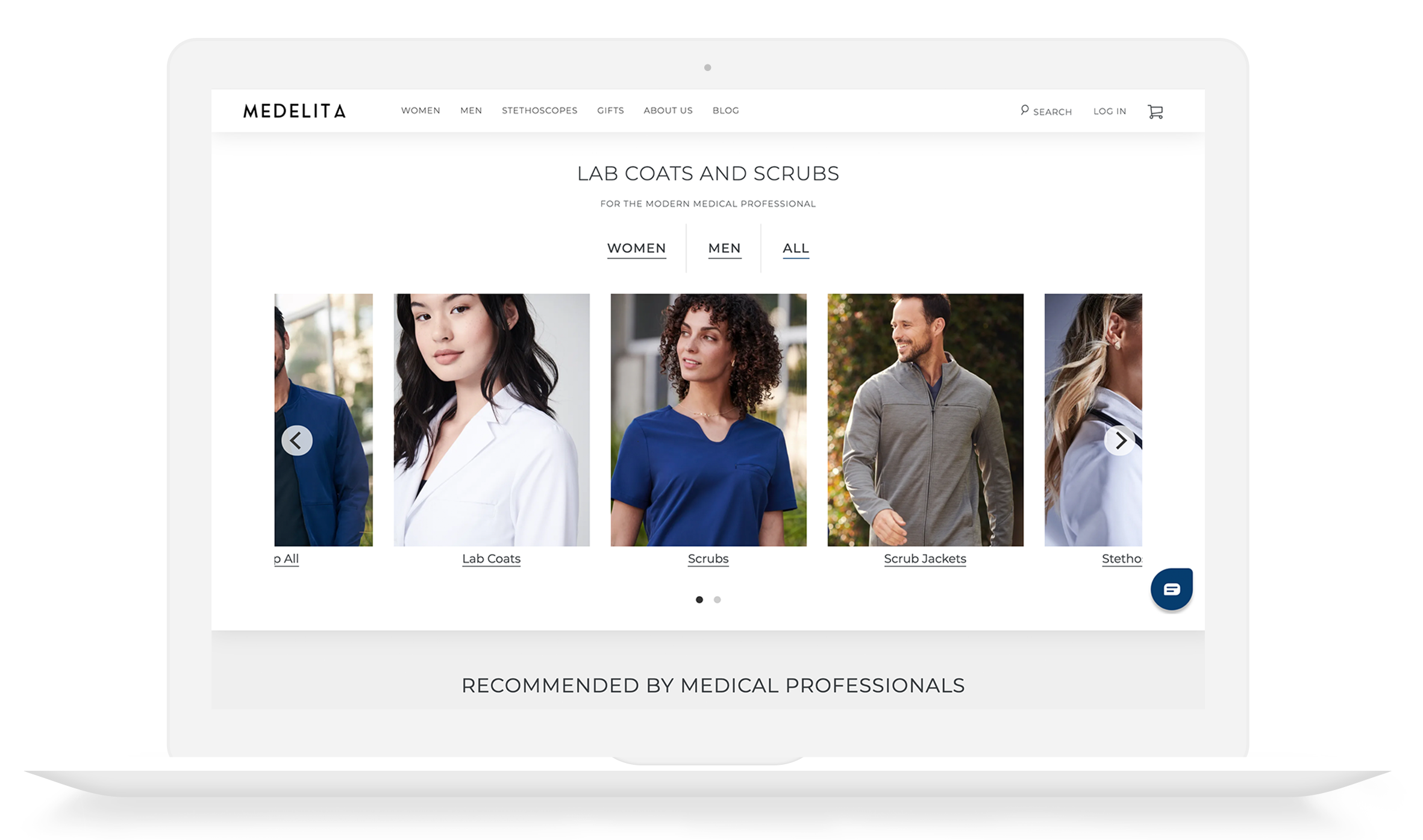
My redesigned landing page.
Design Decisions
Medelita's live landing page almost exactly follows all the recommendations I made in the wireframe above. Here is my rationale behind my design decisions with screen grabs from the live site, which can be seen here. My main goals in my redesign were to provide:
• Better directional guidance
• A strong introduction to the brand
• An efficient organization and flow for the content
I placed these featured categories in a carousel with horizontal scroll to take up less space and surface more information higher up the page. Have Fun!
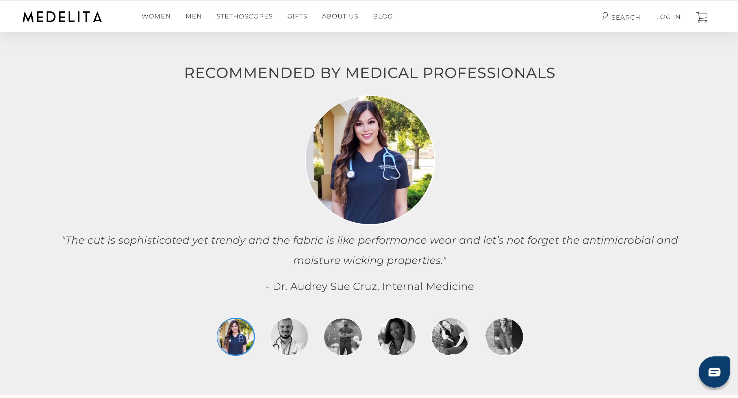
I reformatted text and added pictures to reinforce legtimacy of quotes. I also modified header to indicate that reviews are made by medical professionals in the field and placed section right below the fold to increase visibility of social proof.
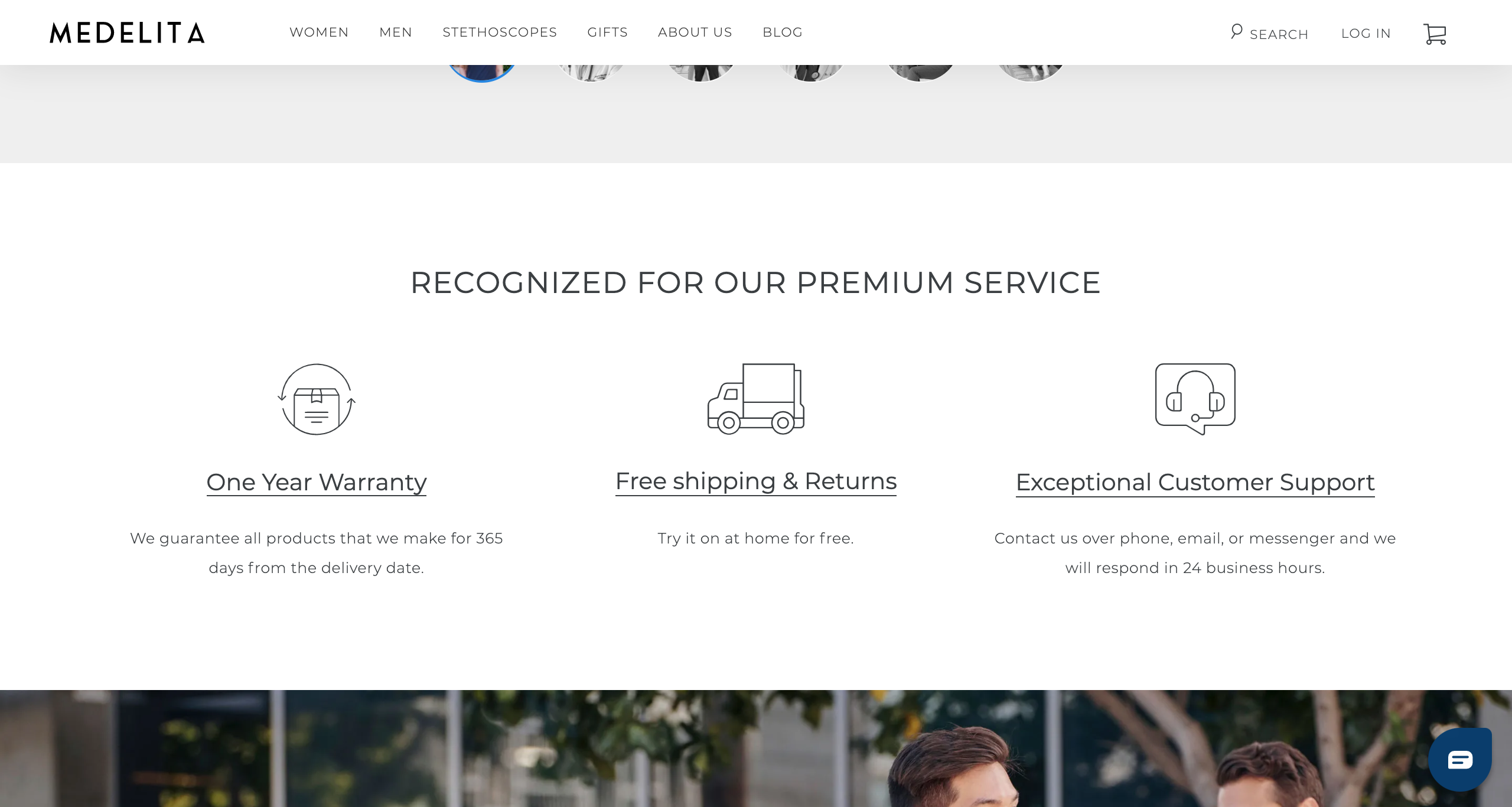
I altered "Exceptional Customer Support" copy to add detail surrounding notable customer service Medelita provides, and removed buttons featured under each icon to clean up the page.
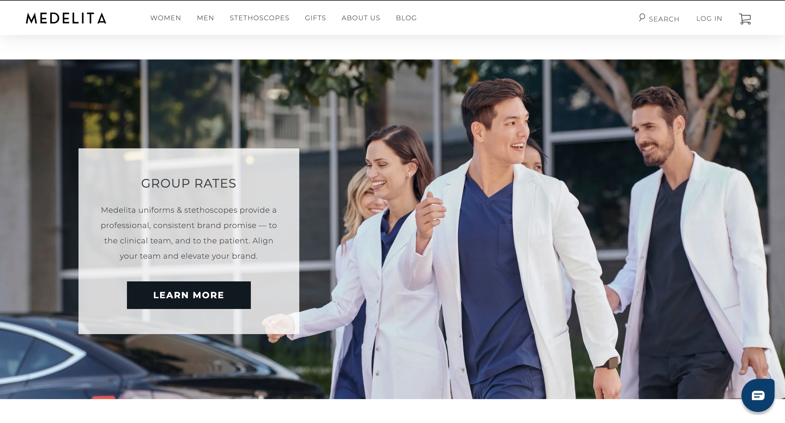
Previously, group orders were described at the bottom of this page, and many users were not exposed to the info. I surfaced this content higher on the page as Medelita wanted to highlight group orders.
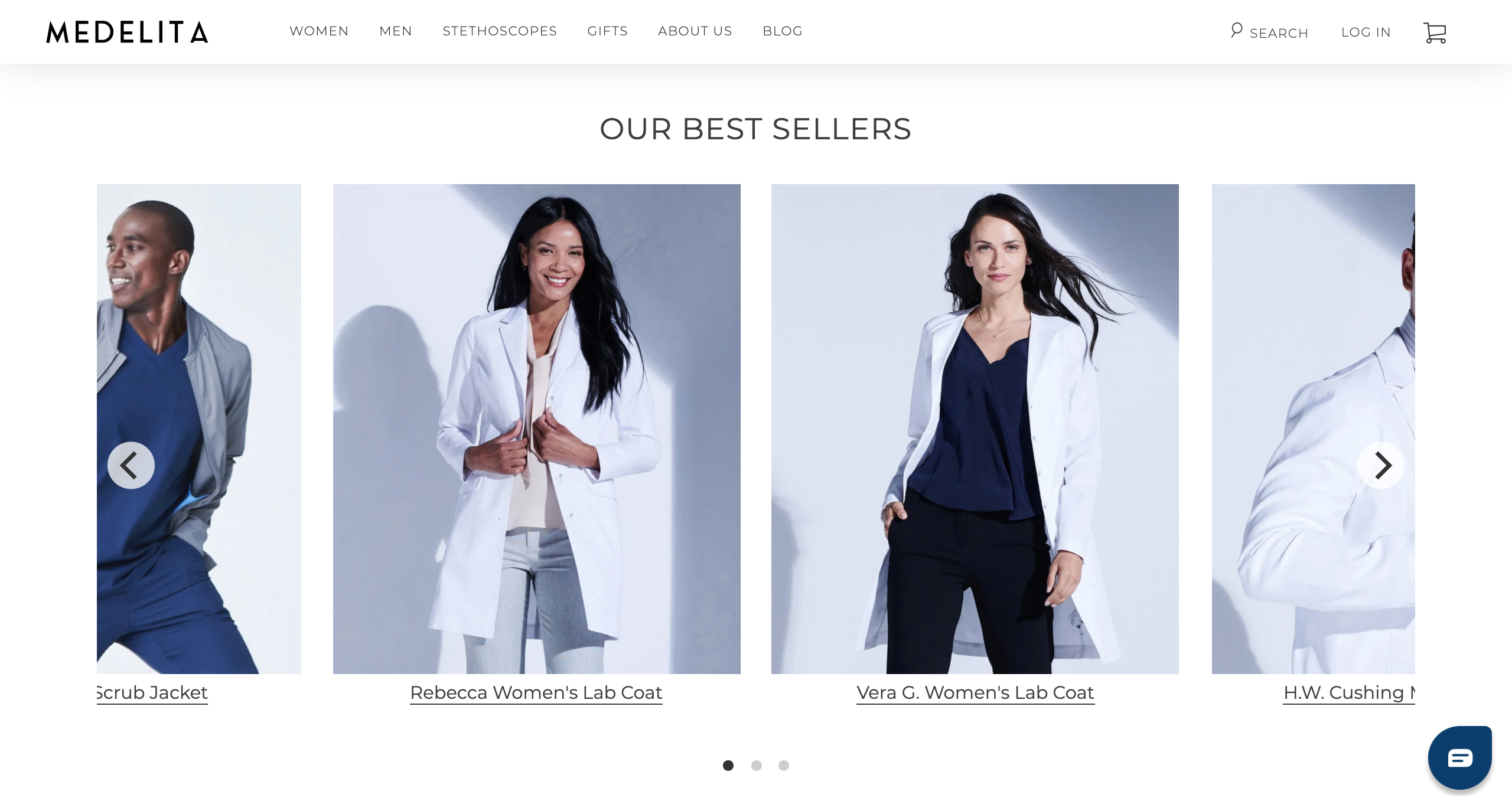
I created a "Best Sellers" carousel to introduce first time visitors to products that Medelita is known for that they might be interested in.
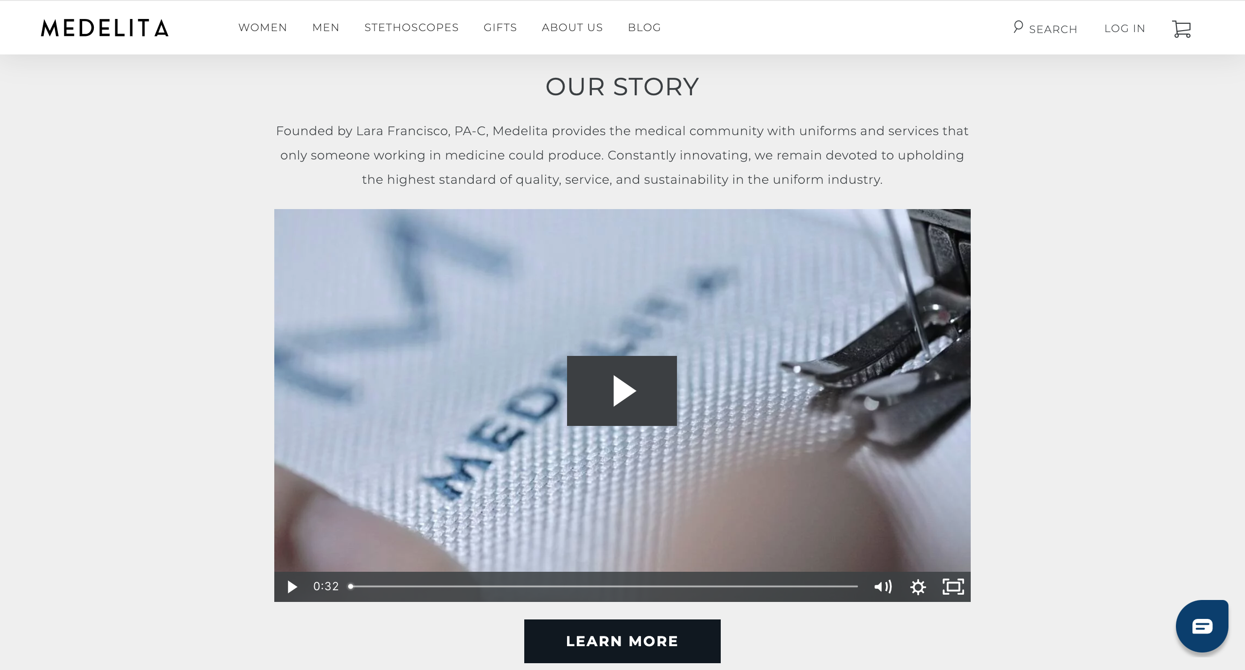
I included a video to illustrate product quality and better prime users for their shopping experience as they browse the site.
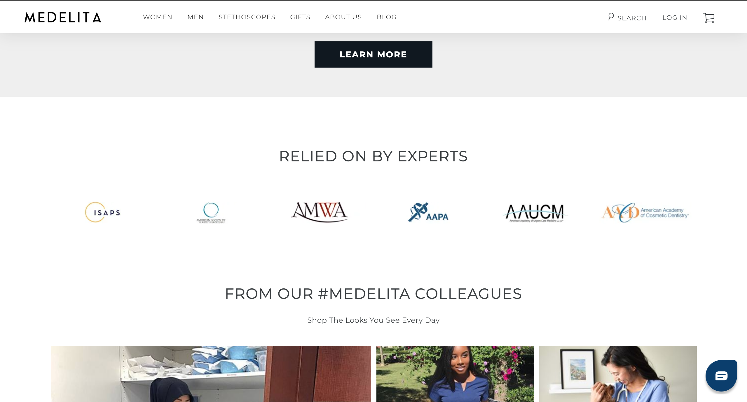
I featured logos of Medelita's well respected partners for additional social proof to increase user’s confidence in their product quality.
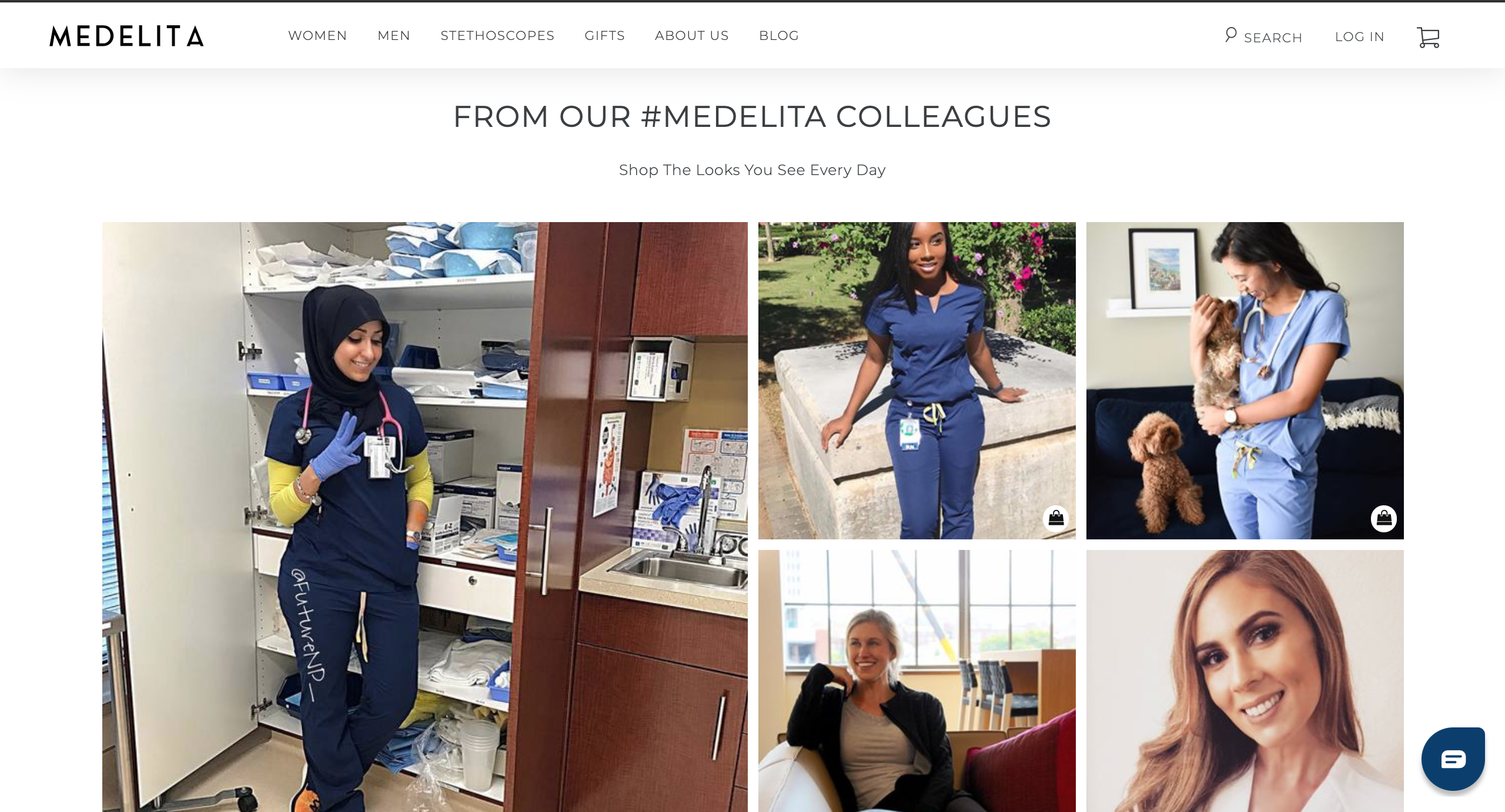
I inserted Instagram shop iconography and simple messaging under the header to indicate to users that they can shop items pictured in photos by interacting with them.
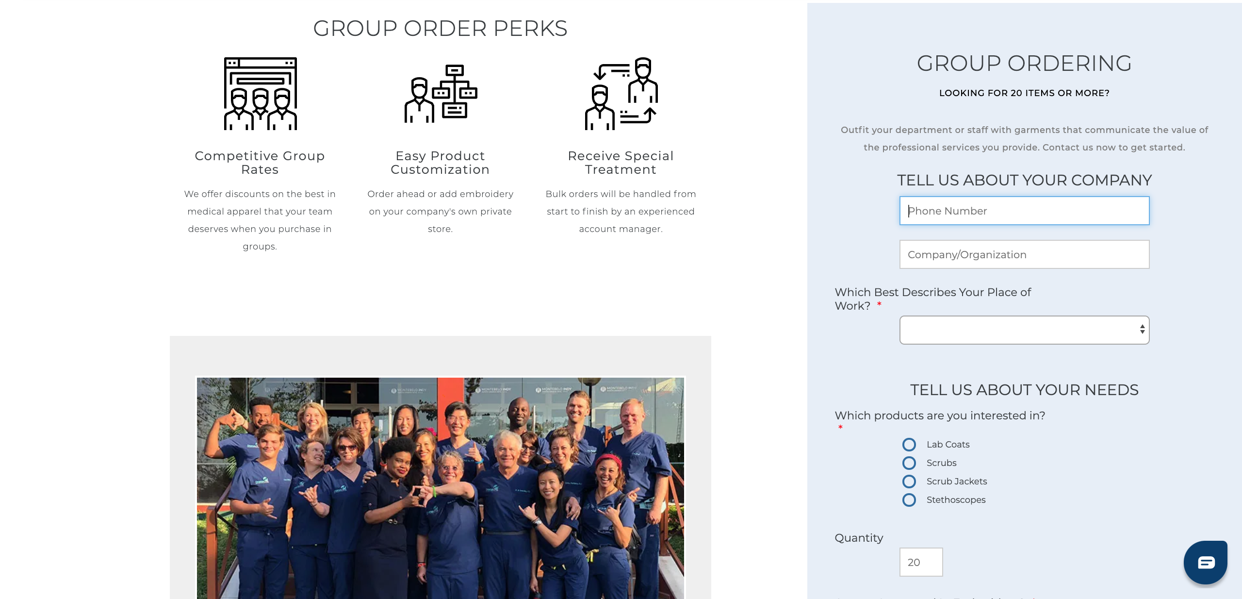
Group Orders
The goal for the new group orders page was to optimize the group order process, which Medelita was promoting.
I altered the structure of the page by placing the form at the top of the page instead of the bottom, and making it sticky, so that it is always accessible to users. Within the form itself, I implemented best of practice in form design and altered copy to better inform guests of group order procedures.
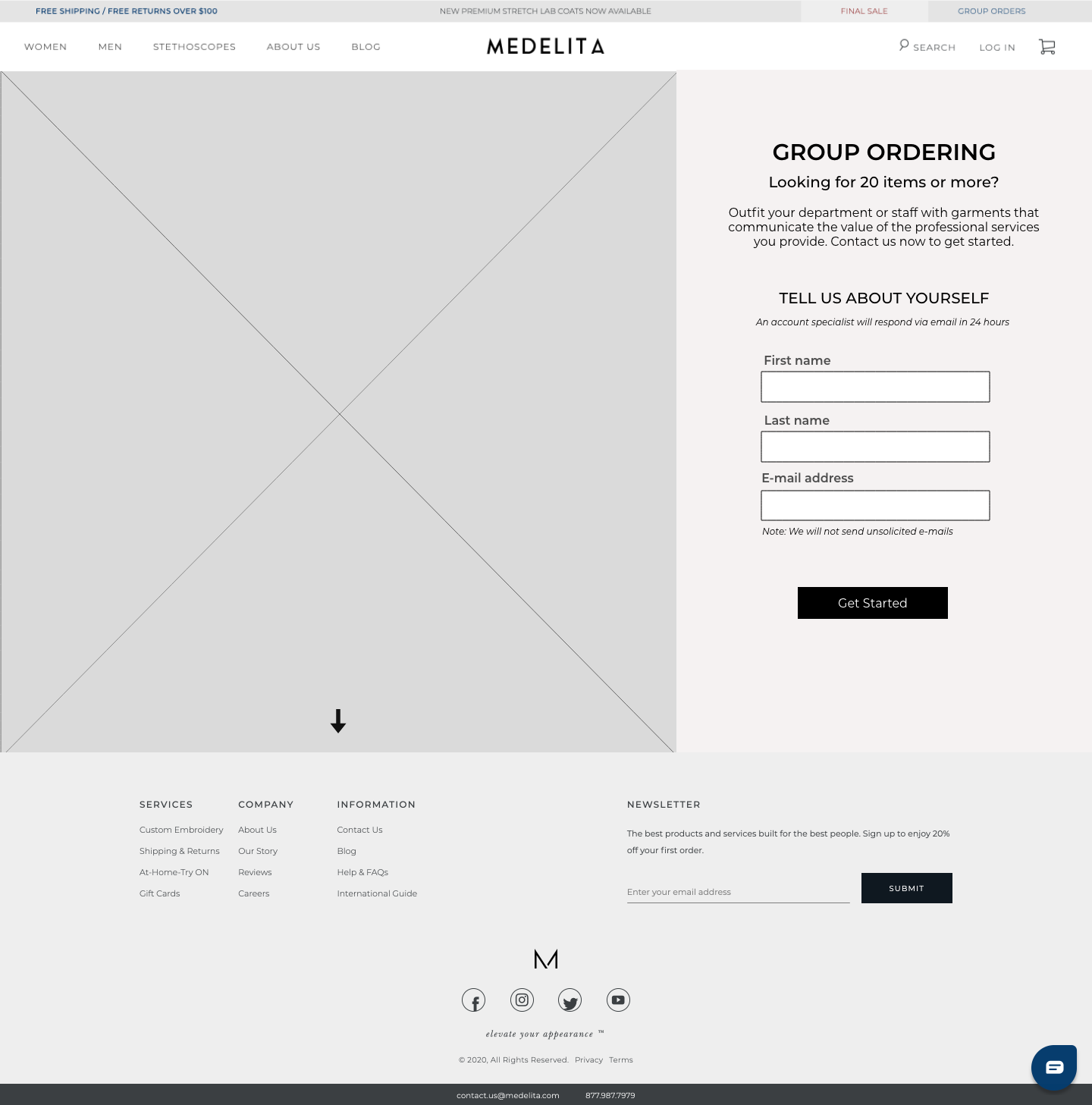
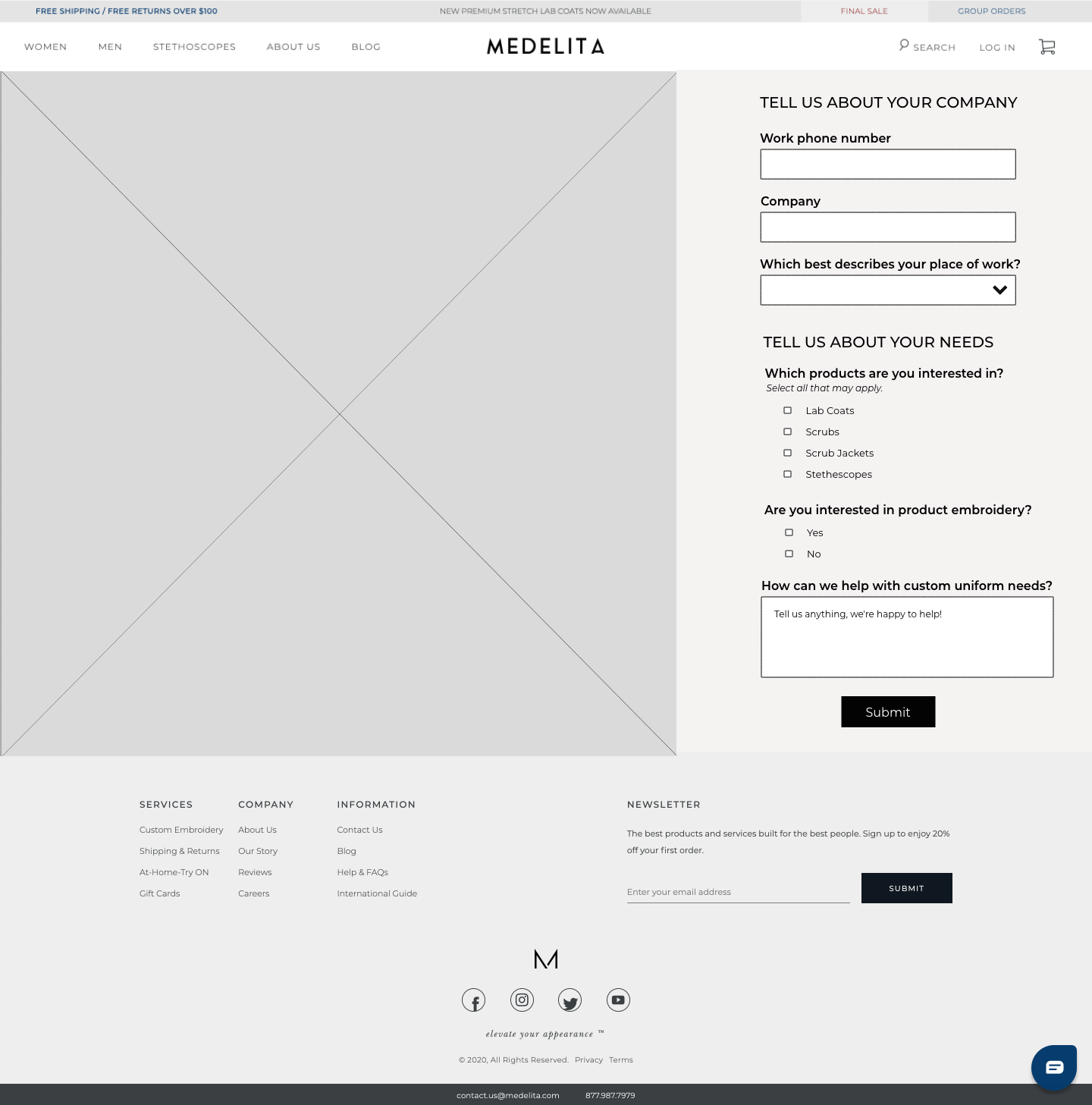
Group Ordering Step 1. I provided messaging to alert users of the 20 item requirement from the beginning of the order, and aligned fields + labels vertically to maximize scannability.
Group Ordering Step 2. I created multiple steps with informative headers to lighten the processing load for users and inserted microcopy to spark some personality throughout the form.
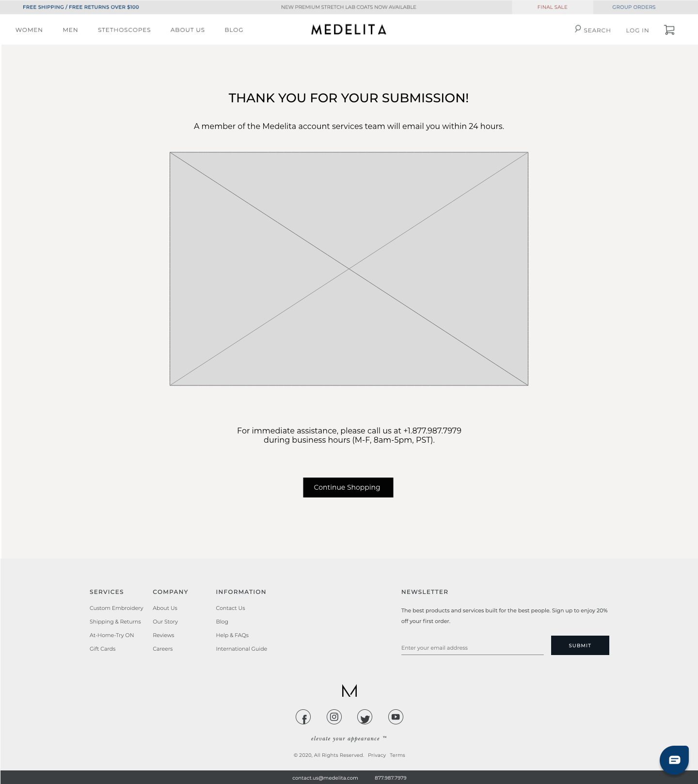
Group Ordering Confirmation Page. We changed the language here to inform users exactly when they should expect a followup from a Medelita representative to provide transparency and peace of mind.
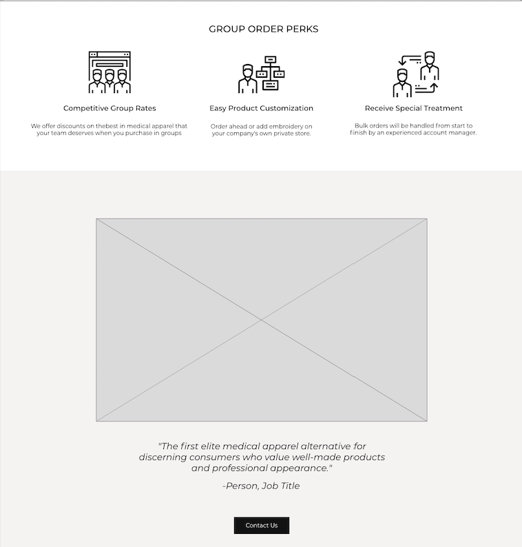
Group Ordering Scrollable Content. I encouraged adding several group statements with photographs here for social proof. My peer and I altered existing Group Order Perks copy to flesh out detail of benefits.
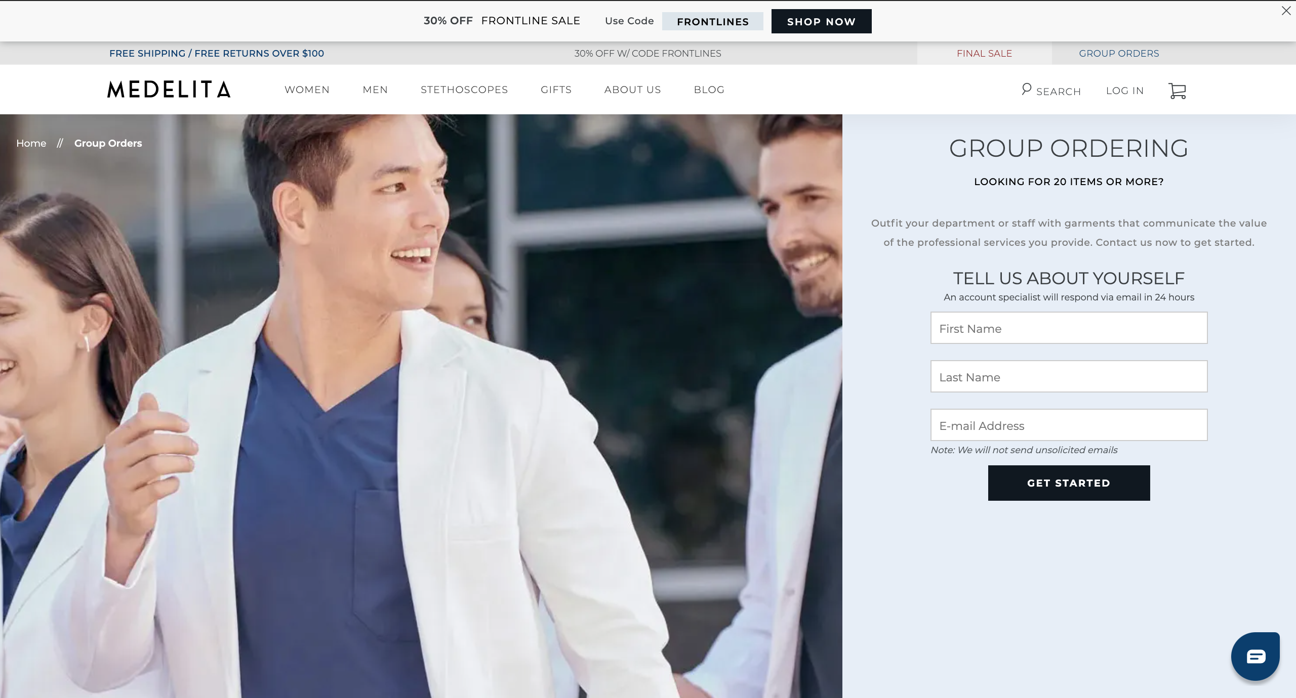
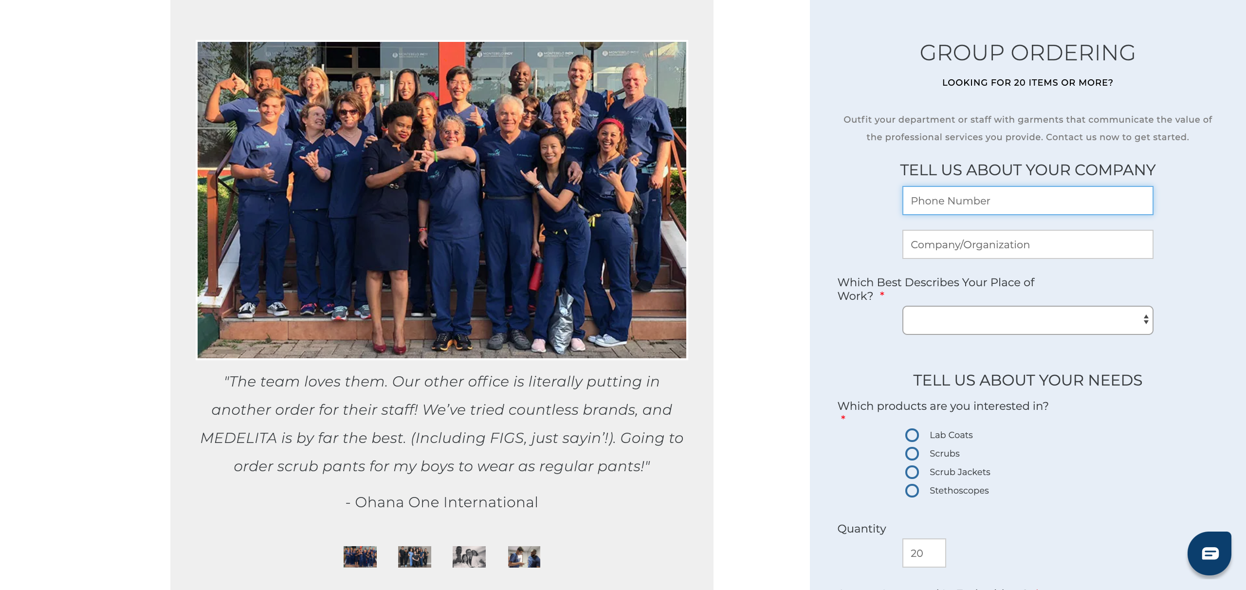
My Group Orders Page design is in the process of being implemented online. Here are some screen shots of it on the live site.
Mobile Designs
Through some Google Analytics insights, I knew a significant portion of Medelita's traffic is coming to the site through mobile devices, and that their revenue breakdown reflects this. Their site would have to be responsive to meet the needs of their mobile users. To facilitate their experience on the site, I also created mobile wireframes for all of the pages I redesigned.

Mobile landing page design.
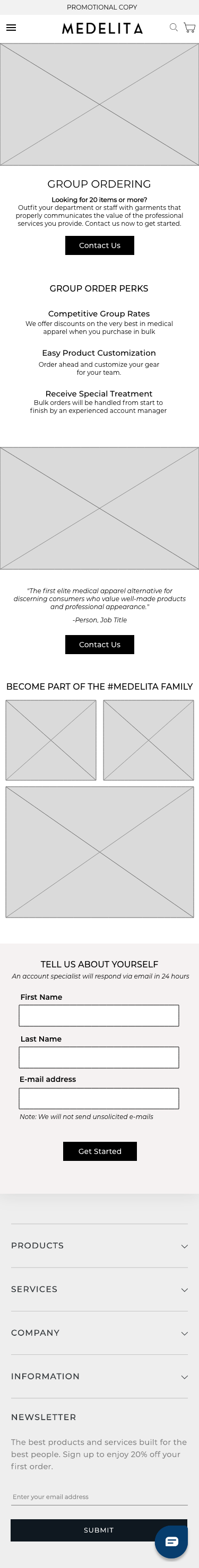
Mobile group order page design.
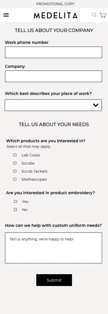
Mobile group order submission page design.
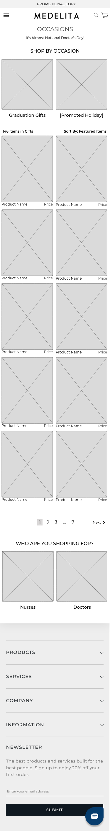
Mobile occasions page design.
The Results
When my team and I presented my wireframes to Medelita, they were excited about the recommendations we made. Medelita tested my landing page design against the original homepage, and in the client's words, the results "blew the old one out of the water". They have since made the changes live to all site visitors.
The group orders and occasions pages are heavier lifting on the development side. Medelita is planning on rolling out our recommendations on those pages as well, and I am looking forward to hear how that goes.
Reflection
Creating these wireframes with the Medelita site forced me to think critically about existing design patterns, to preserve what I thought was successful and make changes where I saw opportunities. I knew that every change I made was intentionally put on the site by the Medelita's team, so I had to be able to ground my decisions in with reasoning to answer any questions they had.
The page I'm probably most proud of is the redesigned group orders page I created. It took me a while to come up with a fresh idea for this page and it's not necessarily conventional. However, both my boss and the client were excited about it when they saw it because it is very conversion focused. Here I learned that taking some risks and working through many design variations can be rewarded
Don't miss these

Wind River AnalyticsUX Design

VinFastUX Design & Research
MedelitaUX Design
Marmoset MusicUX Research
Alaska Airlines CapstoneUX Design + Research
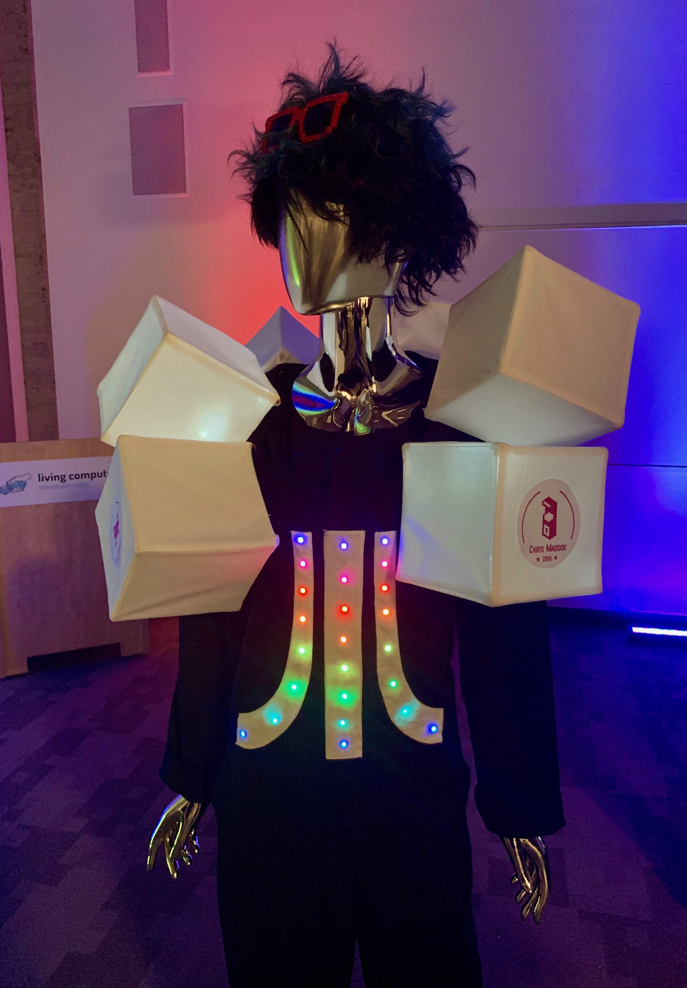
Atari Women SuitE-textile Work
Digital Media @ ReBuilding CenterDigital Media Design
Carina Dempsey 2023